Building a Feature-Rich Text Editor with Tiptap and Nuxt 3
Have you ever tried to build a WYSIWYG editor from scratch? If so, you know it's not easy. Even implementing basic functionalities like bold text, undo/redo, or lists can be time-consuming.
And if you want to build an app with more text-editing features, you'll need much more than just basic styling.
That’s why it’s helpful to look for tools that simplify this process. I’ve used Tiptap for that - it’s a powerful wrapper around ProseMirror, a toolkit for building rich text editors.
In this article, you'll learn how to use Tiptap with Nuxt 3 to create a text-editor app. Many of the features here will be implemented simply by following Tiptap's documentation, but some will require custom plugins. We'll cover both approaches.
Here is the final result:
And here is the code on GitHub. If you find this article helpful, feel free to give it a star ⭐
Github Code
Check out and clone the code on Github to see all the details. For simplicity, some of the code is not included in the article.
What We'll Build
Our text editor will have the following features:
- Working keyboard shortcuts (this is a default Tiptap feature)
- A context-sensitive toolbar that appears when text is selected
- A Notion-like slash commands menu for easier writing
- In-content image uploading
- Text export to Markdown
- Code Blocks with syntax highlighting
Of course, it's possible to add more features. TipTap has a lot of extensions including generative AI, collaboration, comments inside the editor, and many more.
However, I’ve focused on the most useful features that are a solid foundation for the text editor I'm building. If you need more, you can explore TipTap's documentation.
Basic project setup
Let’s start by creating a Nuxt application. You can skip this chapter if you have already created your app.
First, we will initialize the Nuxt application. Use whatever package manager you like:
npx nuxi@latest init text-editor
Then, go to the folder with the project and install the required packages:
cd text-editor
npm install
Now, install Tailwind CSS and its dependencies:
npm install -D tailwindcss postcss autoprefixer
npx tailwindcss init
Also, make sure to configure Tailwind in your nuxt.config.ts:
  postcss: {
    plugins: {
      tailwindcss: {},
      autoprefixer: {},
    },
  },
Set up the Tailwind configuration file:
/** @type {import('tailwindcss').Config} */
module.exports = {
  content: [
    "./components/**/*.{js,vue,ts}",
    "./layouts/**/*.vue",
    "./pages/**/*.vue",
    "./plugins/**/*.{js,ts}",
    "./app.vue",
    "./error.vue",
  ],
  theme: {
    extend: {},
  },
  plugins: [],
}
We will also create a global CSS file with Tailwind directives and add it to the nuxt config file:
// assets/css/main.css
@tailwind base;
@tailwind components;
@tailwind utilities;

// nuxt.config.ts
css: ['~/assets/css/main.css'],
This basic setup helped us install Tailwind CSS and create a new Nuxt project. Now, we can finally start building our editor!
Installing Tiptap and Basic Setup
Okay, so now let’s take this to the next step by installing TipTap. We will start by installing the starter kit that includes the most basic features and extensions.
One important thing to note here - extensions improve TipTap's editor functionality. These can add new features or change how the editor works. Some extensions are simple and don't change the underlying structure, while others are more complex.
There are also pro extensions that require a license (like generative AI).
Right now, we will just install the necessary dependencies from the starter kit. Later, we will add more extensions to boost Tiptap's basic features and try to implement our own extensions.
npm install @tiptap/vue-3 @tiptap/pm @tiptap/starter-kit
Now, go to the app.vue file and replace existing file content with this boilerplate TipTap code. We will use the built-in useEditor composable to create a new editor instance.
<template>
  <editor-content :editor="editor" />
</template>

<script setup lang="ts">
import StarterKit from "@tiptap/starter-kit";
import { useEditor, EditorContent } from "@tiptap/vue-3";

const editor = useEditor({
  content: "<p>I’m running Tiptap with Nuxt 3 🎈</p>",
  extensions: [StarterKit],
});

onBeforeUnmount(() => {
  editor.value?.destroy();
});
</script>
Congratulations! 🎉 You should now see the Tiptap editor in your browser.
Even this minimal setup offers many handy built-in features, such as handling keyboard shortcuts to make text bold or italic.
You can also use different types of content like headings, bullet lists, or blockquotes.
Note that we are also using editor.value?.destroy() here. This will unbind all events related to the editor instance and stop it before the component is unmounted.
Let’s make this editor look better with some CSS.
Styling our editor
Now that we have a basic working editor, let's make it look better. We'll add some custom CSS to style our editor and its content.
First, let's update our assets/css/main.css file with some styles for the Tiptap editor:
Here is the code I’m going to use. It's quite basic, the main point is to make sure that all the nodes in our content, like paragraphs and headings, look as they should.
We'll also center everything on the page and add a bit of padding.
.tiptap {
  max-width: 700px;
  margin: 2rem auto;
  padding: 1rem;
  background-color: #fff;
  outline: none;
}

.tiptap p {
  line-height: 1.6;
  margin: 1rem 0;
}

.tiptap h1,
.tiptap h2,
.tiptap h3,
.tiptap h4,
.tiptap h5,
.tiptap h6 {
  margin: 1.5rem 0 1rem;
  font-weight: bold;
}

.tiptap h1 {
  font-size: 2rem;
}

.tiptap h2 {
  font-size: 1.75rem;
}

.tiptap h3 {
  font-size: 1.5rem;
}

.tiptap h4 {
  font-size: 1.25rem;
}

.tiptap h5 {
  font-size: 1rem;
}

.tiptap h6 {
  font-size: 0.875rem;
}

.tiptap ul {
  list-style: disc;
  padding-left: 1.5rem;
  margin: 1rem 0;
}

.tiptap ul li {
  margin-bottom: 0.5rem;
  line-height: 1.6;
}

.tiptap ol {
  list-style: decimal;
  padding-left: 1.5rem;
  margin: 1rem 0;
}

.tiptap blockquote {
  border-left: 4px solid #ccc;
  padding-left: 1rem;
  color: #666;
  font-style: italic;
  margin: 1rem 0;
}

.tiptap ul,
.tiptap ol {
  margin: 1rem 0 1rem 2rem;
}

.tiptap li {
  margin-bottom: 0.5rem;
}

.tiptap p code {
  color: rgb(231, 41, 161);
  background: #fcf8f8;
  padding: 4px 8px;
  border-radius: 4px;
  font-size: 14px;
}

.tiptap pre {
  background-color: #fcf8f8cc;
  border-radius: 6px;
  margin: 1em 0;
  padding: 10px;
  overflow: hidden;
}

.tiptap pre code {
  display: block;
  padding: 1em;
  overflow-x: auto;
  font-family: "SFMono-Regular", Consolas, "Liberation Mono", Menlo, monospace;
  font-size: 0.9em;
  line-height: 1.5;
  color: #24292e;
}

.tiptap hr {
  border: 0;
  border-top: 1px solid #ccc;
  margin: 2rem 0;
}

.tiptap img {
  max-width: 100%;
  height: auto;
  border-radius: 4px;
  margin: 1rem 0;
}

.tiptap a {
  color: #3498db;
  text-decoration: none;
}

.tiptap a:hover {
  text-decoration: underline;
}

/* Syntax highlighting code will go here */
As you can see it's nothing crazy. We are just making sure that different elements like headings, lists, links look a bit better.
We will also be adding more styles for syntax highlighting later. Right now don't worry about it.
Now, let's also update our app.vue file to add the editor-container class and some tailwind styles. We can also update the initial content to make the default text look better.
<template>
  <div class="editor-container max-w-3xl mx-auto my-8">
    <editor-content :editor="editor" class="prose max-w-none" />
  </div>
</template>

<script setup lang="ts">
import StarterKit from "@tiptap/starter-kit";
import { useEditor, EditorContent } from "@tiptap/vue-3";

const editor = useEditor({
  content: "<h1>Welcome to our Tiptap Editor</h1><p>This is a basic example of a Tiptap editor. Try formatting some text!</p>",
  extensions: [StarterKit],
});

onBeforeUnmount(() => {
  editor.value?.destroy();
});
</script>
Now, let's move on to creating a toolbar, which is a crucial part of every text editor.
Creating a toolbar
Now that we have our basic editor set up, let's add a toolbar to make text formatting easier for our users. We'll create a new component called Toolbar.vue that will contain a few formatting options.
First, let's install the @tiptap/extension-bubble-menu package as we are going to need it later.
npm install @tiptap/extension-bubble-menu
Now, let's create the Toolbar.vue component. We will keep it simple for now, but we'll be gradually adding more formatting options.
<template>
  <bubble-menu
    :editor="editor"
    :tippy-options="{ duration: 100 }"
    v-if="editor"
    :should-show="shouldShow"
    class="flex bg-white rounded-md shadow-md p-1 mb-2.5"
  >
    <div class="flex items-center space-x-2">
      <button
        v-for="action in textActions"
        :key="action.name"
        @click="action.command()"
        :class="{
          'bg-gray-100/80 text-gray-900': editor.isActive(action.name),
        }"
        :title="action.label"
        class="rounded hover:bg-gray-100/80 w-8 h-8 grid place-items-center"
      >
        <Icon :name="action.icon" class="h-5 w-5" />
      </button>
    </div>
  </bubble-menu>
</template>

<script setup lang="ts">
import { Editor, BubbleMenu } from "@tiptap/vue-3";
import type { EditorState } from "@tiptap/pm/state";
import type { EditorView } from "@tiptap/pm/view";

interface TextAction {
  name: string;
  label: string;
  icon: string;
  command: () => void;
}

const props = defineProps<{
  editor?: Editor;
}>();

const shouldShow = (props: {
  editor: Editor;
  view: EditorView;
  state: EditorState;
  oldState?: EditorState;
  from: number;
  to: number;
}) => {
  const { state, from } = props;
  const { doc, selection } = state;
  const { empty } = selection;

  if (empty) return false;

  return true;
};

const textActions: TextAction[] = [
  {
    name: "bold",
    label: "Bold",
    icon: "material-symbols-light:format-bold",
    command: () => props.editor?.chain().focus().toggleBold().run(),
  },
  {
    name: "italic",
    label: "Italic",
    icon: "material-symbols-light:format-italic",
    command: () => props.editor?.chain().focus().toggleItalic().run(),
  },
  {
    name: "strike",
    label: "Strikethrough",
    icon: "material-symbols-light:format-strikethrough",
    command: () => props.editor?.chain().focus().toggleStrike().run(),
  },
];
</script>
This toolbar uses Tiptap's BubbleMenu component, which appears when text is selected. It has just three buttons for basic text formatting: bold, italic, and strikethrough.
Let's break down the key parts of this component:
- We use the
bubble-menucomponent from Tiptap, which handles the positioning and showing/hiding of the toolbar. - The
shouldShowfunction determines when the toolbar should appear. In this case, it only shows when there's a non-empty text selection. - We define an array of textActions, each representing a formatting option with its icon, label, and command to execute.
- The toolbar buttons are rendered in a loop, with their appearance changing based on whether the formatting is active for the current selection.
As you can see, we are using icons to improve the overall toolbar looks. For this project, I am using the nuxt icon module (a version of Iconify for Nuxt3). You can install it with:
npx nuxi module add icon
However, feel free to use any icons you like.
Also, we need to update our app.vue to include the new Toolbar component.
<template>
  <div class="editor-container max-w-3xl mx-auto my-8 flex flex-col">
    <Toolbar :editor="editor" />
    <editor-content :editor="editor" class="prose max-w-none" />
  </div>
</template>

<script setup lang="ts">
import StarterKit from "@tiptap/starter-kit";
import { useEditor, EditorContent } from "@tiptap/vue-3";
import Toolbar from "~/components/Toolbar.vue";

const editor = useEditor({
  content: '<h1>Welcome to our Tiptap Editor</h1><p>This is a basic example of a Tiptap editor. Try formatting some text!</p>',
  extensions: [StarterKit],
});

onBeforeUnmount(() => {
  editor.value?.destroy();
});
</script>
And that's how we set up our basic editor. You can check out how it looks in the video below.
Now that we have our basic setup, let's improve our menu. Our current toolbar works, but we want to add more features like changing text color or content type.
Most of this work involves creating and styling a bubble menu ourselves. However, we'll also need two more extensions to handle text color changes.
npm install @tiptap/extension-text-style @tiptap/extension-color
Let's also add more Tiptap actions to our toolbar menu. These will include elements like bullet lists and ordered lists.
// ...
  {
    name: "bulletList",
    label: "Bullet List",
    icon: "material-symbols-light:format-list-bulleted",
    command: () => props.editor?.chain().focus().toggleBulletList().run(),
  },
  {
    name: "orderedList",
    label: "Numbered List",
    icon: "material-symbols-light:format-list-numbered",
    command: () => props.editor?.chain().focus().toggleOrderedList().run(),
  },
  // ...
Next, we'll implement a custom content-type menu. When you hover over text, this menu will show the current content type and allow you to quickly change it, for example, to a code block.
We'll create a dropdown menu that appears when you click a button. This menu will list all available content types, and clicking on one will change the selected text to that type.
const contentTypes: ContentType[] = [
  {
    name: "paragraph",
    label: "Text",
    icon: "mdi:text",
    command: () => props.editor?.chain().focus().setParagraph().run(),
  },
  {
    name: "heading",
    label: "Heading 1",
    icon: "mdi:format-header-1",
    command: () =>
      props.editor?.chain().focus().toggleHeading({ level: 1 }).run(),
    attrs: { level: 1 },
  },
  {
    name: "heading",
    label: "Heading 2",
    icon: "mdi:format-header-2",
    command: () =>
      props.editor?.chain().focus().toggleHeading({ level: 2 }).run(),
    attrs: { level: 2 },
  },
  {
    name: "heading",
    label: "Heading 3",
    icon: "mdi:format-header-3",
    command: () =>
      props.editor?.chain().focus().toggleHeading({ level: 3 }).run(),
    attrs: { level: 3 },
  },
  {
    name: "bulletList",
    label: "Bullet List",
    icon: "material-symbols-light:format-list-bulleted",
    command: () => props.editor?.chain().focus().toggleBulletList().run(),
  },
  {
    name: "orderedList",
    label: "Numbered List",
    icon: "material-symbols-light:format-list-numbered",
    command: () => props.editor?.chain().focus().toggleOrderedList().run(),
  },
  {
    name: "codeBlock",
    label: "Code Block",
    icon: "mdi:code-tags",
    command: () => props.editor?.chain().focus().toggleCodeBlock().run(),
  },
  {
    name: "blockquote",
    label: "Quote",
    icon: "mdi:format-quote-close",
    command: () => props.editor?.chain().focus().toggleBlockquote().run(),
  },
];
We'll also use a computed property to keep track of the current content type. This will check which type is active and update the display text.
const currentContentType = computed(() => {
  if (props.editor?.isActive("heading", { level: 1 })) return "Heading 1";
  if (props.editor?.isActive("heading", { level: 2 })) return "Heading 2";
  if (props.editor?.isActive("heading", { level: 3 })) return "Heading 3";
  if (props.editor?.isActive("bulletList")) return "Bullet List";
  if (props.editor?.isActive("orderedList")) return "Numbered List";
  if (props.editor?.isActive("codeBlock")) return "Code Block";
  if (props.editor?.isActive("blockquote")) return "Quote";
  return "Text";
});
Lastly, we'll add a color menu.
This will work similarly to the content-type menu. We'll create a list of colors, each with a name and hexadecimal value. We'll also add a function that takes a color value as a parameter and uses Tiptap's built-in function to change the highlighted text color.
const colors: Color[] = [
  { name: "Default", value: "inherit" },
  { name: "Gray", value: "#6B7280" },
  { name: "Brown", value: "#92400E" },
  { name: "Orange", value: "#EA580C" },
  { name: "Yellow", value: "#CA8A04" },
  { name: "Green", value: "#16A34A" },
  { name: "Blue", value: "#2563EB" },
  { name: "Purple", value: "#9333EA" },
  { name: "Pink", value: "#DB2777" },
  { name: "Red", value: "#DC2626" },
];

// ...

const setTextColor = (color: string) => {
  props.editor?.chain().focus().setColor(color).run();
  showColorMenu.value = false;
};
This is just an overview of the code. You can find the full code on GitHub.
And that's it. Below, you can see how the result looks with color and content type menus.
As you can see, TipTap does a lot of heavy lifting by offering these extensions, so we don't have to worry about creating our own floating menu from scratch.
The only thing left is to add content to the toolbar and style it our way (which, as you can see, can be done very smoothly).
Adding a slash commands menu
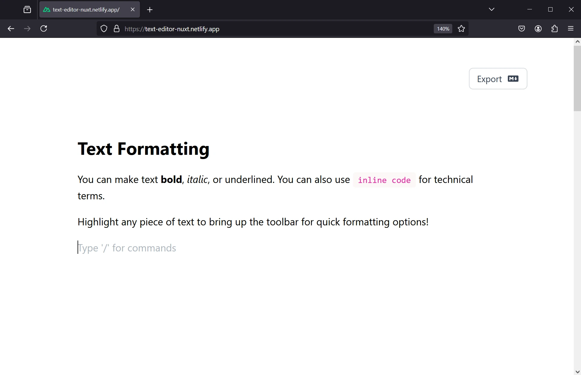
Once we have created our own toolbar, we will take it a step further and create our own slash commands menu.
The idea is very simple → when we are on a new line, we can simply hit /, choose the type of content we want to use, and start writing.
Things here are a bit more complicated than with a toolbar.
When we added a toolbar, we could simply install an existing extension from the TipTap library.
However, at the moment of writing this article (July 30, 2024), there is a documentation page with an example of a slash commands menu, but no official package has been released yet.
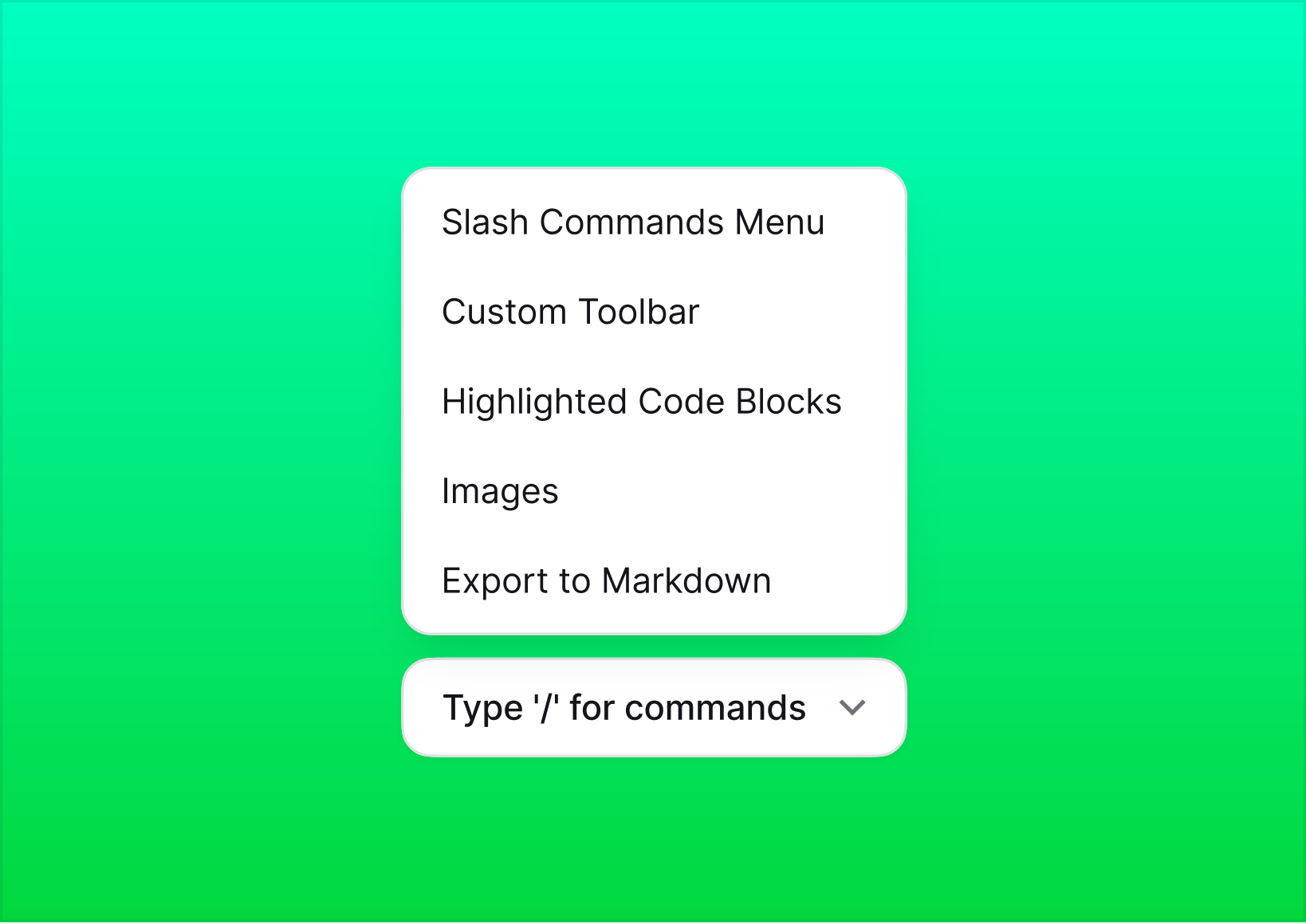
Slash Commands Menu
https://tiptap.dev/docs/examples/experiments/slash-commands
That means we need to create our own extension. Luckily, since slash commands are a popular feature, we don’t need to come up with everything on our own. As the documentation suggests, we can use the source code provided in the link above, copy it, and create our own extension.
Let's start with something simple: a placeholder that appears on every new line, giving users a hint that they can hit a dash to use the slash commands menu.
To do that, we will install a placeholder extension from Tiptap. We will also need the suggestion extension later, so let's install it as well.
npm install @tiptap/extension-placeholder @tiptap/suggestion
And we'll add this to our general CSS code. It's a part of the setup so the placeholder content displays properly.
.tiptap p.is-empty::before {
  color: #adb5bd;
  content: attr(data-placeholder);
  float: left;
  height: 0;
  pointer-events: none;
}
Now, we can import the placeholder extension and configure our initial message.
import Placeholder from "@tiptap/extension-placeholder";

// ...

const editor = useEditor({
  content:
    "<h1>Welcome to our Tiptap Editor</h1><p>This is a basic example of a Tiptap editor. Try formatting some text!</p>",
  extensions: [
    StarterKit,
    Color,
    TextStyle,
    Placeholder.configure({
      placeholder: 'Type "/" for a menu',
    }),
  ],
});
Here is how the placeholder looks:
Ok, so now we need to actually add this menu.
The extension is split into two main parts:
extensions/Commands.ts: Defines the extension structure.extensions/Suggestion.ts: Implements the suggestion functionality.
First, we'll create the Commands.ts file.
import { Extension } from "@tiptap/core";
import Suggestion from "@tiptap/suggestion";

export default Extension.create({
  name: "slash-commands",

  addOptions() {
    return {
      suggestion: {
        char: "/",
        command: ({ editor, range, props }) => {
          props.command({ editor, range });
        },
      },
    };
  },

  addProseMirrorPlugins() {
    return [
      Suggestion({
        editor: this.editor,
        ...this.options.suggestion,
      }),
    ];
  },
});
This file creates the basic structure of the extension:
- It uses
Extension.create()to define a new extension named "slash-commands". - The
addOptions()method sets up the configuration for the suggestion feature, including the trigger character ("/") and the command to execute when a suggestion is selected. addProseMirrorPlugins()integrates the Suggestion plugin with the editor.
Let's continue with creating the Suggestion.ts file for the slash commands menu. This file will handle the core functionality of the suggestion system.
Here's a breakdown of what we'll include in the file:
- Define types for our suggestion items and props.
- Create an array of suggestion items (commands).
- Implement the suggestion logic.
Let's start with a few suggestion items:
import { VueRenderer } from "@tiptap/vue-3";
import tippy from "tippy.js";
import { Editor, Range } from "@tiptap/core";
import CommandsList from "~/components/CommandsList.vue";

interface SuggestionItem {
  name: string;
  description: string;
  icon: string;
  command: (props: { editor: Editor; range: Range }) => void;
}

interface SuggestionProps {
  query: string;
  editor: Editor;
  range: Range;
  clientRect: () => DOMRect;
}

const items: SuggestionItem[] = [
  {
    name: "Text",
    description: "Just start writing with plain text.",
    icon: "mdi:text",
    command: ({ editor, range }) => {
      editor.chain().focus().deleteRange(range).setParagraph().run();
    },
  },
  {
    name: "Heading 1",
    description: "Big section heading.",
    icon: "mdi:format-header-1",
    command: ({ editor, range }) => {
      editor
        .chain()
        .focus()
        .deleteRange(range)
        .setNode("heading", { level: 1 })
        .run();
    },
  },
  // Add more items here...
];
This code sets up the structure for our suggestion items and defines a few example commands. Each item has a name, description, icon, and a command function that will be executed when the item is selected.
Next, let's implement the suggestion logic:
export const suggestion = {
  items: ({ query }: { query: string }): SuggestionItem[] => {
    return items.filter((item) =>
      item.name.toLowerCase().startsWith(query.toLowerCase())
    );
  },

  render: () => {
    let component: VueRenderer;
    let popup: TippyInstance[];

    return {
      onStart: (props: SuggestionProps) => {
        component = new VueRenderer(CommandsList, {
          props,
          editor: props.editor,
        });

        if (!props.clientRect) {
          return;
        }

        popup = tippy("body", {
          getReferenceClientRect: props.clientRect,
          appendTo: () => document.body,
          content: component.element,
          showOnCreate: true,
          interactive: true,
          trigger: "manual",
          placement: "bottom-start",
        });
      },

      onUpdate(props: SuggestionProps) {
        component.updateProps(props);

        if (!props.clientRect) {
          return;
        }

        popup[0].setProps({
          getReferenceClientRect: props.clientRect,
        });
      },

      onKeyDown(props: { event: KeyboardEvent }) {
        if (props.event.key === "Escape") {
          popup[0].hide();
          return true;
        }

        return component.ref?.onKeyDown(props.event);
      },

      onExit() {
        popup[0].destroy();
        component.destroy();
      },
    };
  },
};

export default suggestion;
This part of the code does the following:
- Filters the suggestion items based on the user's input.
- Renders the suggestion list using a Vue component (CommandsList).
- Manages the popup that displays the suggestions using tippy.js.
- Handles keyboard events for navigation and selection.
This extensions uses tippy.js (a tooltip/popover library) under the hood to manage the popup that displays the suggestions.
Now, we need to create the CommandsList.vue component to display our suggestions:
<template>
  <div
    ref="containerRef"
    class="bg-white max-h-80 overflow-y-auto overflow-x-hidden border border-gray-200 shadow-lg rounded-lg py-2 flex flex-col items-start justify-start w-64"
  >
    <div class="px-3 py-2 text-sm text-gray-500 font-medium">BASIC BLOCKS</div>
    <button
      v-for="(item, index) in items"
      :key="item.name"
      :ref="(el) => setItemRef(el as HTMLElement | null, index)"
      class="w-full flex items-center gap-3 px-3 py-2 hover:bg-gray-100 transition-colors duration-150"
      :class="{ 'bg-gray-100': index === selectedIndex }"
      @click="selectItem(index)"
    >
      <div
        class="bg-gray-200 rounded-sm h-8 w-8 flex items-center justify-center"
      >
        <Icon :name="item.icon" class="w-5 h-5 text-gray-600" />
      </div>
      <div class="flex flex-col text-left">
        <span class="text-gray-900 font-medium text-sm">{{ item.name }}</span>
        <span class="text-gray-500 text-xs">{{ item.description }}</span>
      </div>
    </button>
  </div>
</template>

<script setup lang="ts">
import type { SuggestionItem } from "~/types/suggestion";

interface Props {
  items: SuggestionItem[];
  command: (item: SuggestionItem) => void;
}

const props = defineProps<Props>();

const selectedIndex = ref(0);
const containerRef = ref<HTMLElement | null>(null);
const itemRefs = ref<(HTMLElement | null)[]>([]);

const setItemRef = (el: HTMLElement | null, index: number) => {
  itemRefs.value[index] = el;
};

const selectItem = (index: number) => {
  props.command(props.items[index]);
};

const scrollToSelected = () => {
  nextTick(() => {
    const selectedElement = itemRefs.value[selectedIndex.value];
    if (selectedElement && containerRef.value) {
      const container = containerRef.value;
      const elementTop = selectedElement.offsetTop;
      const elementBottom = elementTop + selectedElement.offsetHeight;
      const containerTop = container.scrollTop;
      const containerBottom = containerTop + container.clientHeight;

      if (elementTop < containerTop) {
        container.scrollTop = elementTop;
      } else if (elementBottom > containerBottom) {
        container.scrollTop = elementBottom - container.clientHeight;
      }
    }
  });
};

const onKeyDown = (event: KeyboardEvent): boolean => {
  if (event.key === "ArrowUp") {
    selectedIndex.value =
      (selectedIndex.value - 1 + props.items.length) % props.items.length;
    scrollToSelected();
    return true;
  }
  if (event.key === "ArrowDown") {
    selectedIndex.value = (selectedIndex.value + 1) % props.items.length;
    scrollToSelected();
    return true;
  }
  if (event.key === "Enter") {
    selectItem(selectedIndex.value);
    return true;
  }
  return false;
};

/* ... */
</script>
This component will render the list of suggestions and handle selection. I've also added an invisible search input that will be used to filter the suggestions. That way when a user starts typing, the suggestions will be filtered based on the input and there is a scroll to the selected item.
Also, users can navigate through the suggestions using the arrow keys and select an item by pressing the Enter key. For me, it's one of the most helpful features when writing content.
Finally, we need to add our new extension to the editor configuration:
import Commands from "~/extensions/Commands";
import suggestion from "~/extensions/Suggestion";

const editor = useEditor({
  content: "<p>some initial content...</p>",
  extensions: [
    // ... other extensions
    Commands.configure({
      suggestion,
    }),
  ],
});
Ok, so let's sum things up:
- We created a custom slash commands menu for our Tiptap editor.
- We added two main files:
Commands.tsfor the extension structure andSuggestion.tsfor the suggestion functionality. - We defined suggestion items with names, descriptions, icons, and commands.
- We created a
CommandsList.vuecomponent to display the suggestions. - We used tippy.js to manage the popup that shows the suggestions.
- We integrated the new extension into our editor configuration.
And now we are left with a great slash commands menu that we can use on every new line of text in our editor.
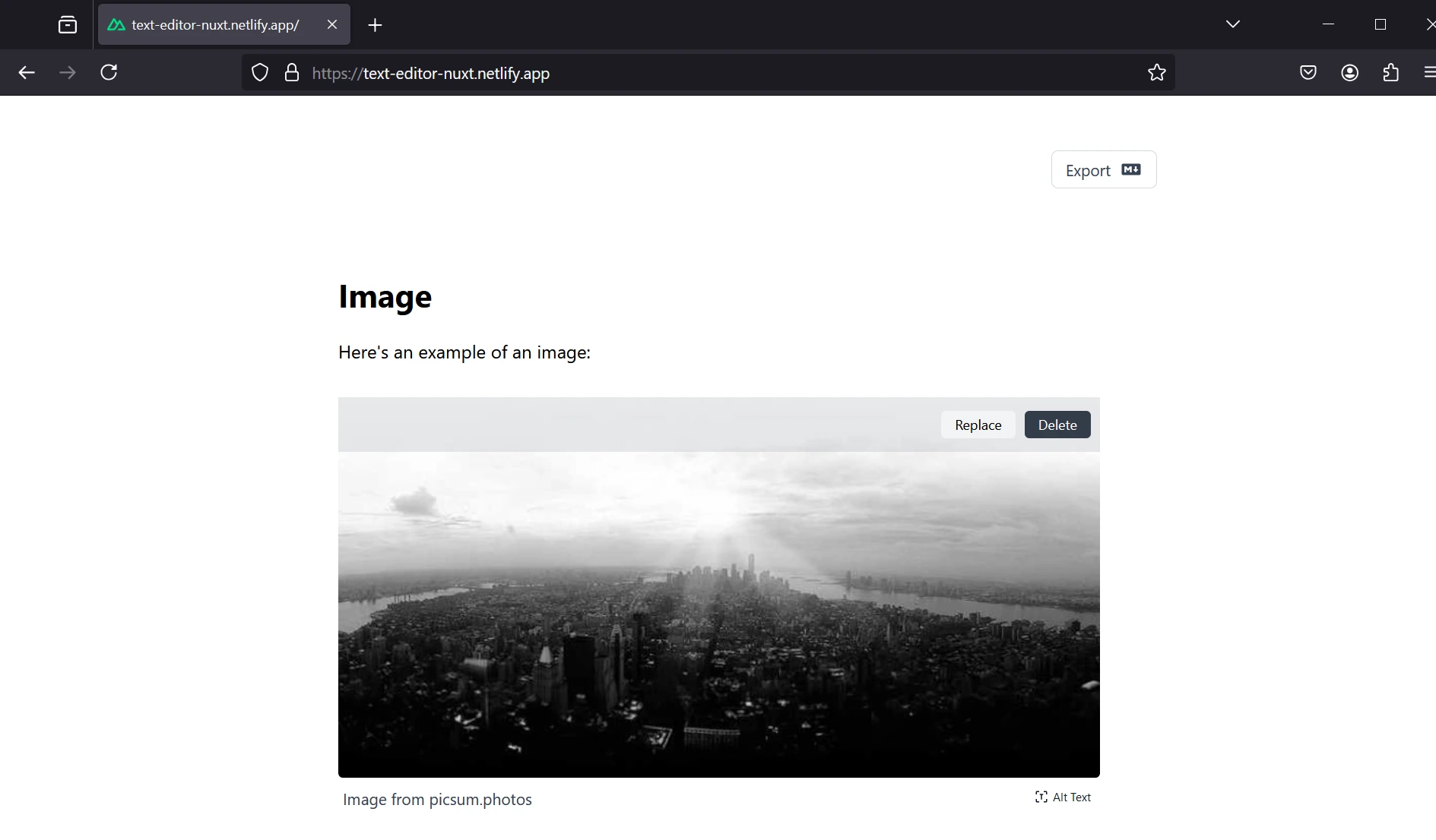
Images
Images are crucial in content creation. They break up the text, illustrate points, and make content more engaging. A good image component should let users:
- Upload images easily
- Add captions and alt text for accessibility
- Replace or delete images
- ✨ Resize and position images (though we haven't implemented this yet. I'm planning on adding this feature in the future)
Let's start by creating our own image extension. Here's how it works:
First, let's define the extension in extensions/ImageUpload.ts:
import { Node, mergeAttributes } from "@tiptap/core";
import { VueNodeViewRenderer } from "@tiptap/vue-3";
import ImageUpload from "~/components/ImageUpload.vue";

export interface ImageUploadAttributes {
  src: string | null;
  alt: string | null;
  caption: string | null;
}

export const ImageUploadNode = Node.create<never, ImageUploadAttributes>({
  name: "imageUpload",

  group: "block",
  selectable: true,

  atom: true,

  addAttributes() {
    return {
      src: {
        default: null,
      },
      alt: {
        default: undefined,
      },
      caption: {
        default: null,
      },
    };
  },

  parseHTML() {
    return [
      {
        tag: "image-upload",
      },
    ];
  },

  renderHTML({ HTMLAttributes }) {
    return ["image-upload", mergeAttributes(HTMLAttributes)];
  },

  addNodeView() {
    return VueNodeViewRenderer(ImageUpload);
  },
});

export default ImageUploadNode;
This extension creates a new node type called "imageUpload". It uses a custom Vue component for rendering.
The extension defines attributes for the image source, alt text, and caption. It also specifies how the node should behave within the editor.
Next, we create the ImageUpload.vue component:
<template>
  <node-view-wrapper class="max-w-full w-full my-6">
    <input
      type="file"
      accept="image/*"
      @change="handleFileUpload"
      ref="fileInput"
      class="hidden"
    />
    <div v-if="!node.attrs.src" class="upload-placeholder">
      <button
        @click="triggerFileInput"
        class="bg-gray-300/40 hover:bg-gray-100 text-gray-800 font-medium py-2 px-4 rounded-lg shadow-sm flex items-center justify-center w-full h-16 transition duration-150 ease-in-out"
      >
        <Icon name="mdi:image-plus" class="w-6 h-6 mr-3 text-gray-400" />
        <span class="text-gray-500 text-sm">Click to upload an image</span>
      </button>
    </div>
    <div v-else class="relative group">
      <div class="rounded-lg overflow-hidden">
        <img
          :src="node.attrs.src"
          :alt="node.attrs.alt"
          class="w-full h-auto object-cover !my-1"
        />
        <div
          class="image-actions absolute top-1 left-0 right-0 h-12 opacity-0 group-hover:opacity-100 transition-opacity duration-200 bg-gray-800/10 flex items-center justify-end px-2 space-x-2"
        >
          <button
            class="bg-gray-100/90 rounded shadow-xs h-6 px-3 text-black font-medium text-xs"
            @click="triggerFileInput"
          >
            Replace
          </button>
          <button
            class="bg-gray-800/90 rounded shadow-xs h-6 px-3 text-white font-medium text-xs"
            @click="removeImage"
          >
            Delete
          </button>
        </div>
      </div>
      <div class="flex items-center relative">
        <input
          type="text"
          v-model="inputText"
          @input="updateText"
          @keydown.enter.prevent="handleEnter"
          :placeholder="showAltText ? 'Add alt text' : 'Add a caption'"
          class="w-full px-1 py-1 text-sm text-gray-700 bg-transparent focus:outline-none transition duration-150 ease-in-out placeholder-gray-400"
        />
        <button
          @click="toggleAltText"
          class="absolute right-0 bottom-1 bg-transparent text-gray-900 text-[10px] font-medium px-2 py-1 rounded transition duration-150 ease-in-out flex items-center"
        >
          <Icon
            :name="showAltText ? 'mdi:text-short' : 'mdi:text-recognition'"
            class="size-3 mr-1"
          />
          {{ showAltText ? "Caption" : "Alt Text" }}
        </button>
      </div>
    </div>
  </node-view-wrapper>
</template>

// the rest of the code
This component handles the UI for uploading, displaying, and managing images. It includes features like:
- A placeholder for uploading new images
- Display of the uploaded image
- Buttons to replace or delete the image
- Input fields for caption and alt text
Note, that we use the Node View Wrapper for the image upload component. This is a special wrapper component in Tiptap that helps manage the node view.
Finally, we add the extension to our editor in app.vue:
import ImageUpload from "~/extensions/ImageUpload";
import Image from "@tiptap/extension-image";

// ...

const editor = useEditor({
  extensions: [
    ImageUpload,
    Image,
    // ...
  ],
  // ...
});
By adding ImageUpload to our extensions array, we enable the custom image functionality in our editor.
The result? Users can easily add images to their content, complete with captions and alt text, making the content more visually appealing.
This setup gives us a solid foundation for handling images in our editor. In the future, we could expand on this by adding image resizing, alignment options, or even integrating with a cloud storage service for better image management.
You can also use a JavaScript image editor like Pintura, which allows users to crop images, rotate them, add filters, and more.
Pintura
https://pqina.nl/pintura/
Code Blocks
Code blocks are an essential feature for technical writing, letting you insert and format code snippets with syntax highlighting. To add them to our project, we'll install and use the @tiptap/extension-code-block-lowlight extension.
This extension integrates with the lowlight library to provide syntax highlighting for different programming languages. For this feature, we'll also use our custom Vue component to display the code blocks.
However, before we add this component to our editor, we need to add some styles to our project. That way we can customize the syntax highlighting.
.tiptap pre {
  background-color: #fcf8f8cc;
  border-radius: 6px;
  margin: 1em 0;
  padding: 10px;
  overflow: hidden;
}

.tiptap pre code {
  display: block;
  padding: 1em;
  overflow-x: auto;
  font-family: "SFMono-Regular", Consolas, "Liberation Mono", Menlo, monospace;
  font-size: 0.9em;
  line-height: 1.5;
  color: #24292e;
}

.hljs-comment,
.hljs-quote {
  color: #6a737d;
  font-style: italic;
}

.hljs-keyword,
.hljs-selector-tag {
  color: #d73a49;
}

.hljs-string,
.hljs-attr,
.hljs-variable,
.hljs-template-variable {
  color: #032f62;
}

/* more syntax highlighting styles */
These styles ensure that different code elements (comments, keywords, strings, etc.) are colored for better readability.
Now, let's add our custom code block component with an option to select the programming language:
<template>
  <node-view-wrapper class="code-block relative">
    <div class="absolute right-2 top-2 z-10">
      <div class="relative">
        <select
          v-model="selectedLanguage"
          @change="selectLanguage"
          class="appearance-none flex items-center space-x-1 px-2 py-1 pr-8 text-xs font-medium text-gray-600 bg-gray-100 rounded-md hover:bg-gray-200 focus:outline-none focus:ring-2 focus:ring-gray-300 transition-colors duration-200"
        >
          <option :value="null">auto</option>
          <option
            v-for="language in languages"
            :key="language"
            :value="language"
          >
            {{ language }}
          </option>
        </select>
        <div
          class="pointer-events-none absolute inset-y-0 right-0 flex items-center px-2 text-gray-600"
        >
          <Icon name="heroicons:chevron-down-20-solid" class="w-4 h-4" />
        </div>
      </div>
    </div>
    <pre><code><node-view-content /></code></pre>
  </node-view-wrapper>
</template>

<script setup lang="ts">
import { NodeViewContent, nodeViewProps, NodeViewWrapper } from "@tiptap/vue-3";

const props = defineProps(nodeViewProps);

const languages = computed(() =>
  props.extension.options.lowlight.listLanguages()
);

const selectedLanguage = computed({
  get: () => props.node.attrs.language,
  set: (language: string | null) => props.updateAttributes({ language }),
});

const selectLanguage = (event: Event) => {
  const target = event.target as HTMLSelectElement;
  selectedLanguage.value = target.value;
};
</script>
This component adds a language selector to each code block, allowing users to specify the programming language for more accurate syntax highlighting.
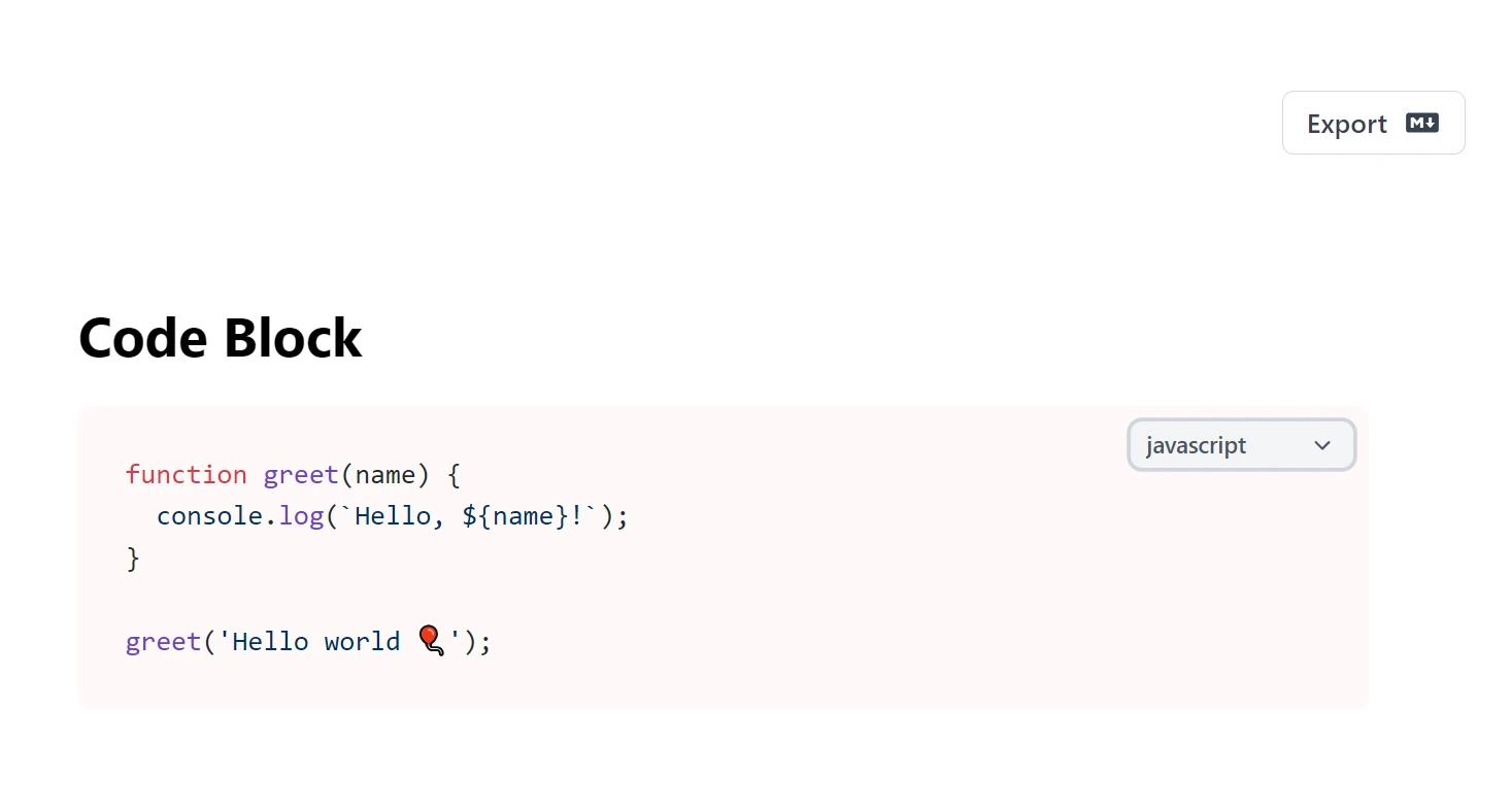
Here's a breakdown of how it works:
- The component uses Tiptap's
NodeViewWrapperandNodeViewContentto create a custom view for code blocks in the editor. NodeViewWrappercontains the entire custom node, including extra UI elements, whileNodeViewContentmanages the code content. This setup allows us to add features to code blocks while keeping them fully functional.- The component displays a dropdown menu for selecting the programming language.
- It uses
computedproperties to manage the selected language and available language options from thelowlightlibrary. - The
selectLanguagefunction updates the code block's language attribute when the user makes a selection.
Now, if we want to use our custom CodeBlock component, we need to extend the CodeBlockLowlight extension in our editor config:
import CodeBlockLowlight from "@tiptap/extension-code-block-lowlight";
import CodeBlock from "./components/CodeBlock.vue";
import { common, createLowlight } from "lowlight";

// ...

const lowlight = createLowlight(common);

// ...

CodeBlockLowlight.extend({
  addNodeView() {
    return VueNodeViewRenderer(CodeBlock);
  },
}).configure({ lowlight }),
This code does a few important things:
- First, we initialize the
lowlightlibrary, which is a syntax highlighting library. - Then, we extend the
CodeBlockLowlightextension with our customCodeBlockcomponent. This is done usingVueNodeViewRenderer(CodeBlock), which tells Tiptap to use our Vue component to render code blocks. - The
.configure({ lowlight })part passes our lowlight instance to the extension, so the syntax highlighting works.
That way we can do it all inside the Extensions array without having to create a new file.
Exporting the Content in Markdown Format
Lastly, let's give our users the ability to export the content in Markdown format.
It's important to note that Tiptap offers an official Export extension, but it requires setting up JWT authentication and doesn't work with custom nodes.
Export Extension
https://tiptap.dev/docs/editor/extensions/functionality/export
That's why, for our project, I decided to implement a custom export logic that's simple yet effective, focusing on Markdown export.
However, if you need to export your content in other formats, you can use this extension. Just keep in mind that it may require some additional configuration, especially if you've added custom nodes to your editor.
And, our custom implementation in ExportButtons.vue works out of the box for Markdown export. Here's an overview of the logic:
First, the exportDocument function is triggered when the user clicks the export button. That's when we get the JSON content from the editor.
const exportDocument = () => {
  try {
    const json = props.editor?.getJSON();
    if (json) {
      const markdown = convertToMarkdown(json);
      downloadMarkdown(markdown);
    }
  } catch (error) {
    console.error("Error during export:", error);
  }
};
Now, the convertToMarkdown function is the core of our export logic. It processes the JSON content from the editor and converts it to Markdown:
const convertToMarkdown = (json: JSONContent): string => {
let markdown = "";
const processNode = (node: ContentNode | TextNode): string => {
switch (node.type) {
case "paragraph":
return processContentNodes(node.content) + "\n\n";
case "heading":
const level = "#".repeat(node.attrs?.level as number);
return `${level} ${processContentNodes(node.content)}\n\n`;
case "text":
return isTextNode(node) ? processTextNode(node) : "";
case "bulletList":
return processListItems(node.content, "- ") + "\n";
case "orderedList":
return (
processListItems(node.content, (index) => `${index + 1}. `) + "\n"
);
case "listItem":
return processContentNodes(node.content).trim();
case "codeBlock":
const code = processContentNodes(node.content);
const language = node.attrs?.language || "";
return `\`\`\`${language}\n${code}\n\`\`\`\n\n`;
case "blockquote":
return (
node.content?.map((n) => `> ${processNode(n)}`).join("") + "\n\n"
);
case "horizontalRule":
return "___\n\n";
case "imageUpload":
const { src, alt, caption } = node.attrs as {
src: string;
alt?: string;
caption?: string;
};
return `\n\n`;
default:
return "";
}
};
const isTextNode = (node: ContentNode | TextNode): node is TextNode => {
return node.type === "text" && "text" in node;
};
const processContentNodes = (
content?: (ContentNode | TextNode)[]
): string => {
return content?.map(processNode).join("") || "";
};
const processTextNode = (node: TextNode): string => {
let text = node.text;
if (node.marks) {
node.marks.forEach((mark) => {
switch (mark.type) {
case "bold":
text = `**${text}**`;
break;
case "italic":
text = `*${text}*`;
break;
case "code":
text = `\`${text}\``;
break;
}
});
}
return text;
};
const processListItems = (
content: (ContentNode | TextNode)[] | undefined,
prefix: string | ((index: number) => string)
): string => {
if (!content) return "";
return (
content
.map((item, index) => {
const itemPrefix =
typeof prefix === "function" ? prefix(index) : prefix;
return `${itemPrefix}${processNode(item)}`;
})
.join("\n") + "\n"
);
};
if (Array.isArray(json.content)) {
json.content.forEach((node) => {
markdown += processNode(node as TextNode);
});
}
return markdown.trim();
};
Key aspects of this function:
- It handles different node types (paragraphs, headings, lists, code blocks, etc.)
- It also processes text nodes with formatting (bold, italic, code)
- And, it converts custom nodes like
imageUploadto Markdown image syntax
Keep in mind that this function is a simplified version of the Markdown export logic. It may need to be expanded to support other formats or additional features in the future.
And lastly, using the downloadMarkdown function we create a downloadable Markdown file:
const downloadMarkdown = (markdown: string) => {
  const blob = new Blob([markdown], { type: "text/markdown" });
  const url = URL.createObjectURL(blob);
  const a = document.createElement("a");
  a.href = url;
  a.download = "exported_document.md";
  document.body.appendChild(a);
  a.click();
  document.body.removeChild(a);
  URL.revokeObjectURL(url);
};
This approach allows us to:
- Export content directly to Markdown without external dependencies
- Handle custom nodes (like our
imageUpload) - Easily extend the export logic for other custom elements
Once again - you can add support for other formats later. The setup makes it easy to add new formats with extra conversion functions, or you can simply use the TipTap import/export extension.
Final Words
That's it for creating a custom editor with Tiptap and Nuxt. Of course, this is a simplified version of the editor, but it should give you a good starting point for your own project.
You can also add more features like AI, websocket collaboration, an option to add comments inside the editor, see collaboration history, etc.
TipTap offers a well-documented API, so you can easily extend the editor with all the functionalities I just mentioned.
Hopefully, this article will help you get started with creating your own editor.