Creating a Search Bar with Keyboard Navigation in Vue
Today, I’m going to show you how to build a simple search bar with keyboard navigation in Vue3.
I'm writing this because I think building your own components that can be reused in different projects can be very helpful in the long run. This search bar can fit pretty much any website.
We'll be using Vue, TypeScript, and Tailwind. You'll see it's very easy to make.
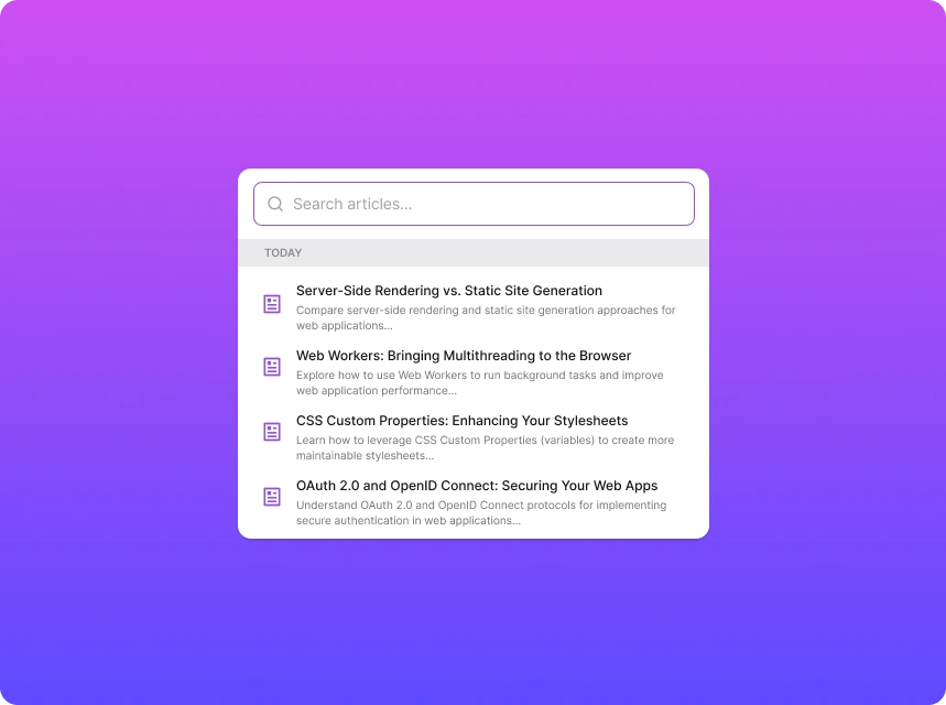
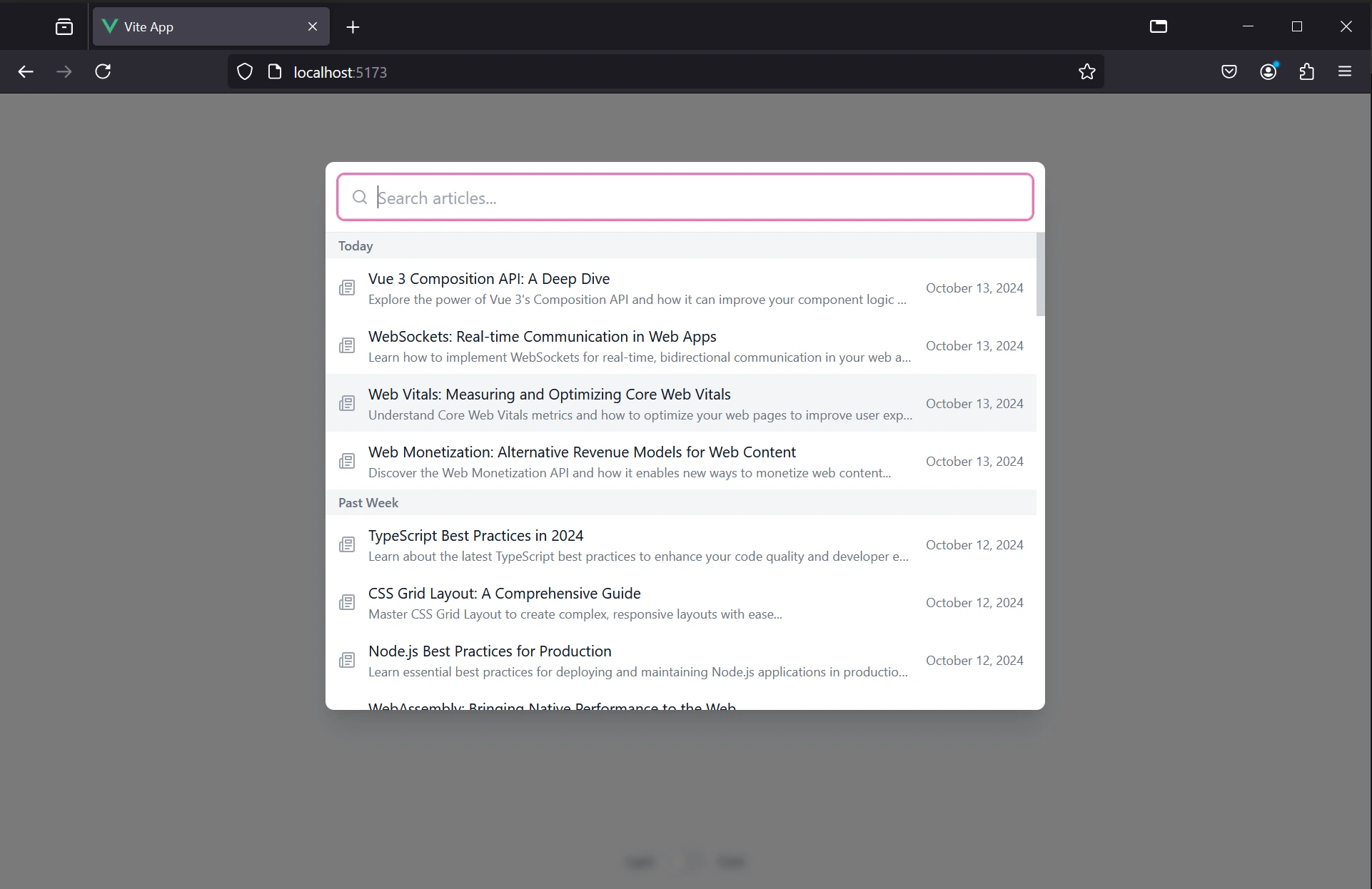
Here's a preview of what we'll be building:
And here is the code on GitHub. If you find this article helpful, feel free to give it a star ⭐
Github Code
Check out and clone the code on Github to see all the details. For simplicity, some of the code is not included in the article.
Quick Project Setup
If you already have a project set up, feel free to skip to the next section. But, if you're starting from scratch, let's quickly set up a new Vue 3 project using Vite:
npm create vue@latest
Follow the prompts to configure your project. Once created, navigate to your project directory and install the dependencies:
cd your-project-name
npm install
Next, let's add Tailwind CSS to our project for styling:
npm install -D tailwindcss postcss autoprefixer
npx tailwindcss init -p
Remember to also add tailwind configuration to the tailwind.config.js and postcss.config.js files.
// tailwind.config.js

/** @type {import('tailwindcss').Config} */
export default {
  purge: ["./index.html", "./src/**/*.{vue,js,ts,jsx,tsx}"],
  darkMode: "class", // optional dark mode
  theme: {
    extend: {},
  },
  variants: {
    extend: {},
  },
  plugins: [],
};

// postcss.config.js

export default {
  plugins: {
    tailwindcss: {},
    autoprefixer: {},
  },
};
Lastly, I recommend removing unused files like HelloWorld.vue, assets folder's content, etc.
Building the Search Bar
Let's start by creating the structure for our search bar. In your components folder, create a new file called SearchBar.vue. We'll break down the key parts of this component.
First, let's look at the main container for our search bar:
<template>
  <Transition name="fade">
    <div
      v-if="isOpen"
      class="fixed inset-0 bg-black/50 backdrop-blur-sm flex items-start justify-center pt-16 px-4 z-50"
    >
      <div
        class="w-full max-w-2xl bg-white dark:bg-gray-800 rounded-lg shadow-xl overflow-hidden"
      >
This implementation creates a full-screen overlay with a semi-transparent background when the search bar is open. The isOpen prop controls the visibility of the search bar.
Next, let's add the key component: a search input. We'll use it to filter articles and add event listeners for keyboard navigation.
We'll use the keyup event instead of keydown for smoother keyboard navigation. The keyup event triggers after the key is released, preventing issues that can occur when a user holds down a key (I tried using keydown at first, but it caused some issues with the scrollbar).
  <SearchIcon
    class="absolute left-3 top-1/2 transform -translate-y-1/2 text-gray-400 w-4 h-4"
  />
  <input
    v-model="searchQuery"
    ref="searchInput"
    placeholder="Search articles..."
    class="w-full bg-transparent text-gray-900 dark:text-white text-base rounded-md pl-9 pr-3 py-2 border border-gray-300 dark:border-gray-600 focus:outline-none focus:ring-2 focus:ring-pink-400"
    @input="searchArticles"
    @keyup.down.prevent="navigateList('down')"
    @keyup.up.prevent="navigateList('up')"
    @keydown.enter.prevent="selectArticle()"
  />
Here, we have an input field with a search icon. The v-model directive binds the input to our searchQuery reactive variable. Later we will add functions to handle the keyboard navigation.
Keep in mind that I've also added two icon components from Lucide that you can find in the GitHub repository of this article.
Below our search bar, we display articles grouped by their creation date. Instead of showing a plain list, we've organized the search results into categories. Here's how it looks:
  <template
    v-for="(group, groupName) in groupedArticles"
    :key="groupName"
  >
    <div
      v-if="group.length > 0"
      class="px-3 py-1 text-xs font-semibold text-gray-500 dark:text-gray-400 bg-gray-100 dark:bg-gray-700/50"
    >
      {{ groupName }}
    </div>
This code iterates through the grouped articles and displays a header for each non-empty group (like "Today", "Past Week", etc.).
For each article within a group, we also render a list item:
  <li
    v-for="article in group"
    :key="article.id"
    :class="[
      'px-3 py-2 cursor-pointer transition-colors duration-150 ease-in-out hover:bg-gray-100 dark:hover:bg-gray-700',
      {
        'bg-gray-100 dark:bg-gray-700':
          selectedArticleId === article.id,
      },
      `article-entry-${article.id}`,
    ]"
    @click="selectArticle(article)"
    @mouseover="selectedArticleId = article.id"
  >
    <div class="flex items-center space-x-3">
      <ArticleIcon class="text-gray-400 w-4 h-4 flex-shrink-0" />
      <div class="flex-grow min-w-0">
        <span
          class="text-gray-900 dark:text-white font-medium text-sm block truncate"
        >
          {{ article.title }}
        </span>
        <p
          class="text-xs text-gray-500 dark:text-gray-400 mt-0.5 truncate"
        >
          {{ article.content }}
        </p>
      </div>
      <span
        class="text-xs text-gray-500 dark:text-gray-400 flex-shrink-0"
      >
        {{ getReadableDate(article.createdAt) }}
      </span>
    </div>
This creates a list item for each article, displaying:
- The article's title
- A snippet of its content
- The creation date
The important part here is the article-entry-${article.id} class. We will use it later to scroll to the selected article using the native JavaScript scrollIntoView method.
scrollIntoView
https://developer.mozilla.org/en-US/docs/Web/API/Element/scrollIntoView
This covers the template part of our component. In the next section, we'll add the necessary script to make it functional as well.
Adding Custom Keyboard Navigation
In a real-world application, you'd typically fetch articles from some backend. However, for this example, we've created a local mock backend using the articles.ts file. This file contains an array of article objects and a function to simulate pagination.
import type { Article } from "@/types/Article";

const today = new Date();
const yesterday = new Date(today);
yesterday.setDate(yesterday.getDate() - 1);
const lastWeek = new Date(today);
lastWeek.setDate(lastWeek.getDate() - 7);
const lastMonth = new Date(today);
lastMonth.setMonth(lastMonth.getMonth() - 1);
const older = new Date(today);
older.setFullYear(older.getFullYear() - 1);

const BATCH_SIZE = 10;

export const fetchArticles = (page: number): Article[] => {
  const sortedArticles = articlesData.sort(
    (a, b) => new Date(b.createdAt).getTime() - new Date(a.createdAt).getTime()
This setup allows us to focus on the frontend implementation without worrying about backend integration.
Now, let's implement the selection and navigation logic in our SearchBar.vue component. First, we'll add all the necessary imports and reactive variables:
<script setup lang="ts">
import { ref, computed, watch, nextTick } from "vue";
import { fetchArticles } from "@/data/articles";
// ...

const selectedArticleId = ref<string | null>(null);
const scrollContainer = ref<HTMLDivElement | null>(null);
</script>
The selectedArticleId ref is crucial for tracking the currently selected article. It's used for both custom keyboard navigation and infinite scroll functionality.
We've also added two computed properties -> filteredArticles and groupedArticles:
The groupedArticles property organizes the filtered articles by creation date:
const groupedArticles = computed(() => {
  const groups: Record<string, Article[]> = {
    Today: [],
    "Past Week": [],
    "Past Month": [],
    Older: [],
  };

  filteredArticles.value.forEach((article) => {
    const diffDays = getDaysSinceCreation(article.createdAt);
    if (diffDays === 0) groups["Today"].push(article);
    else if (diffDays < 7) groups["Past Week"].push(article);
    else if (diffDays < 30) groups["Past Month"].push(article);
    else groups["Older"].push(article);
  });
  return groups;
});
While filteredArticles returns articles that match the search query:
const filteredArticles = computed(() =>
  searchQuery.value
    ? articles.value.filter((article) =>
        article.title.toLowerCase().includes(searchQuery.value.toLowerCase())
      )
    : articles.value
);
I've also added the selectArticle() function that triggers when an article is selected, and emits an event to open a Toast notification from outside the search bar component.
However, this is just the beginning. The key function for this part is the navigateList function, which enables us to navigate through the list of articles using the keyboard.
Previously, we could see that this function was triggered by the keyup event on the search input.
  <input
    @keyup.down.prevent="navigateList('down')"
    @keyup.up.prevent="navigateList('up')"
    @keydown.enter.prevent="selectArticle()"
  />
After the user presses a certain key, this function updates the selectedArticleId based on the navigation direction and ensures that the selected item is scrolled into view.
<script setup lang="ts">
const navigateList = (direction: "up" | "down") => {
  const currentIndex = filteredArticles.value.findIndex(
    (a) => a.id === selectedArticleId.value
  );
  const totalItems = filteredArticles.value.length;
  if (totalItems === 0) return;

  const newIndex =
    direction === "down"
      ? (currentIndex + 1) % totalItems
      : (currentIndex - 1 + totalItems) % totalItems;

  selectedArticleId.value = filteredArticles.value[newIndex].id;

  nextTick(() => {
    const selectedElement = scrollContainer.value?.querySelector(
      `.article-entry-${selectedArticleId.value}`
    ) as HTMLElement;

    if (selectedElement && scrollContainer.value) {
      selectedElement.scrollIntoView({
        behavior: "smooth",
        block: "nearest",
      });
    }
  });
};
</script>
Note how we use nextTick to ensure the DOM is updated before scrolling to the selected item. We are also using scrollIntoView method, a native JavaScript method, to scroll to the selected item.
That way users can use the keyboard to navigate through the list and the selected item is always in the view.
Infinite Scroll
Infinite scroll is a popular technique that loads more content as the user scrolls down, providing a quicker browsing and better UX.
Infinite Scroll Done Right
https://www.smashingmagazine.com/2022/03/designing-better-infinite-scroll/
Let's implement this feature in our search bar.
First, we'll add some reactive variables to manage the loading state and pagination:
const currentPage = ref(0);
const isLoading = ref(false);
const hasMore = ref(true);
Next, we'll create a function to load more articles:
const loadMoreArticles = async () => {
  if (isLoading.value || !hasMore.value) return;

  isLoading.value = true;
  const newArticles = fetchArticles(currentPage.value);

  if (newArticles.length === 0) {
    hasMore.value = false;
  } else {
    articles.value.push(...newArticles);
    currentPage.value++;
  }

  isLoading.value = false;
};
This function fetches a new batch of articles and adds them to our existing list. It also manages the loading state and checks if there are more articles to load.
To trigger the loading of more articles, we'll use a watcher on the selectedArticleId:
watch(selectedArticleId, () => {
  if (
    selectedArticleId.value ===
    filteredArticles.value[filteredArticles.value.length - 1].id
  ) {
    loadMoreArticles();
  }
});
This watcher checks if the selected article is the last one in the list. If it is, then we just load more articles.
Now, we need to initialize the articles when the search bar is opened. It also could be done without a watcher, as a function that triggers when the search bar is opened.
watch(
  () => props.isOpen,
  (newValue) => {
    if (newValue) {
      loadMoreArticles();
      searchQuery.value = "";
      selectedArticleId.value = filteredArticles.value[0].id;
      nextTick(() => searchInput.value?.focus());
    }
  }
);
This watcher loads the initial batch of articles when the search bar is opened, resets the search query, and focuses the search input (so you can start typing right away).
With these changes, our search bar now supports infinite scrolling. As the user navigates through the list using keyboard or mouse, more articles will be loaded automatically when they reach the end of the current list.
If you'd like make this feature more UX-friendly, you could also add some sort of a loader.
<template>
  <Loader v-show="isLoading" />
</template>
Suggestions for Improvement
There is definitely potential to improve this component by adding more features and improving the existing ones.
For example, it can be frustrating for users when they navigate the list using the keyboard while their cursor is already positioned on an article. This causes the list to jump to the selected item, breaking smooth navigation.
Also, it would be a good idea to add an option to close the search bar when clicking outside of it (either by using a Vue click-outside plugin or through a native implementation).
Finally, I would recommend integrating the search bar with a live search feature that filters articles in real-time as the user types. I didn’t add this since we are using a local mock backend, but you should keep it in mind for the future.
Final Words
Thank you for reading this article. I hope you found it useful. If you have any questions, feel free to ask.
Once again, you can find the full source code in the GitHub repository.
Github Code
Check out and clone the code on Github to see all the details. For simplicity, some of the code is not included in the article.
See you next time!